Analytics tool
Toluna's B2B survey analytics tool (2015). Improve users' engagement after launching a survey
Analytics Tool
Company: Toluna
Role: UX&UI expert
Background
Toluna's analytics tool allows users to get relevant insights from surveys they launched in Toluna's products. When creating a survey and targeting the audience, the survey creator can follow the process in real-time. One of the main action for survey creator is the option to follow the answers, filter them and be aware of how many people from the total targeted respondents have finished to answer each question.
Challenge
Analytics tool most of the time includes a lot of action options. Survey creators can 'crop' targeted respondents and create from the data another report that will show new insights. Survey analysts would like to share with other people the results or export them to another program. The main action is to create cross data between answers, to define better the survey results.
The main challenge is to allow to create all these functionalities, and also showing in a prominent way the most important data and insights.
The Solutions - All In One Place
The program we have is crowded with actions and as mentioned above, the reason for that is multiple actions that the user can make. After I split all the actions we have and made a list of them, we saw that it makes more sense to combine some actions together. Testing exceptions with potential users helped me to understand the hierarchy in the product.
I created this new content hierarchy. These buttons affect on all the survey questions:
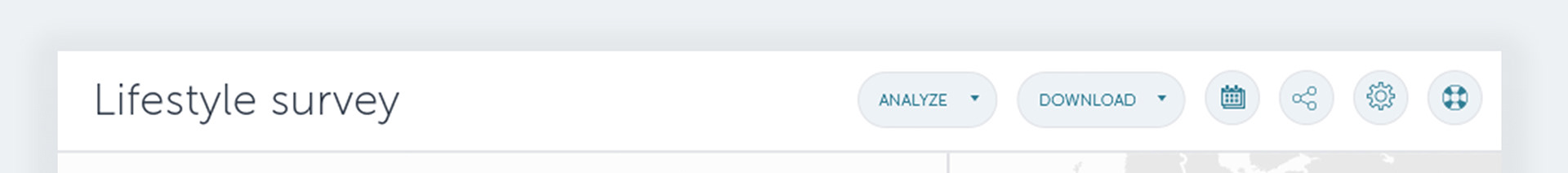
The two main actions are: Analyzing and downloading options, which are more in use, and were added in a prominent way.
In addition, we added the most common action shortcuts: Filtering the survey results by date, sharing the survey with others, change settings which allow to filter what is hidden or shown, and the last one, prominent button for our help center.
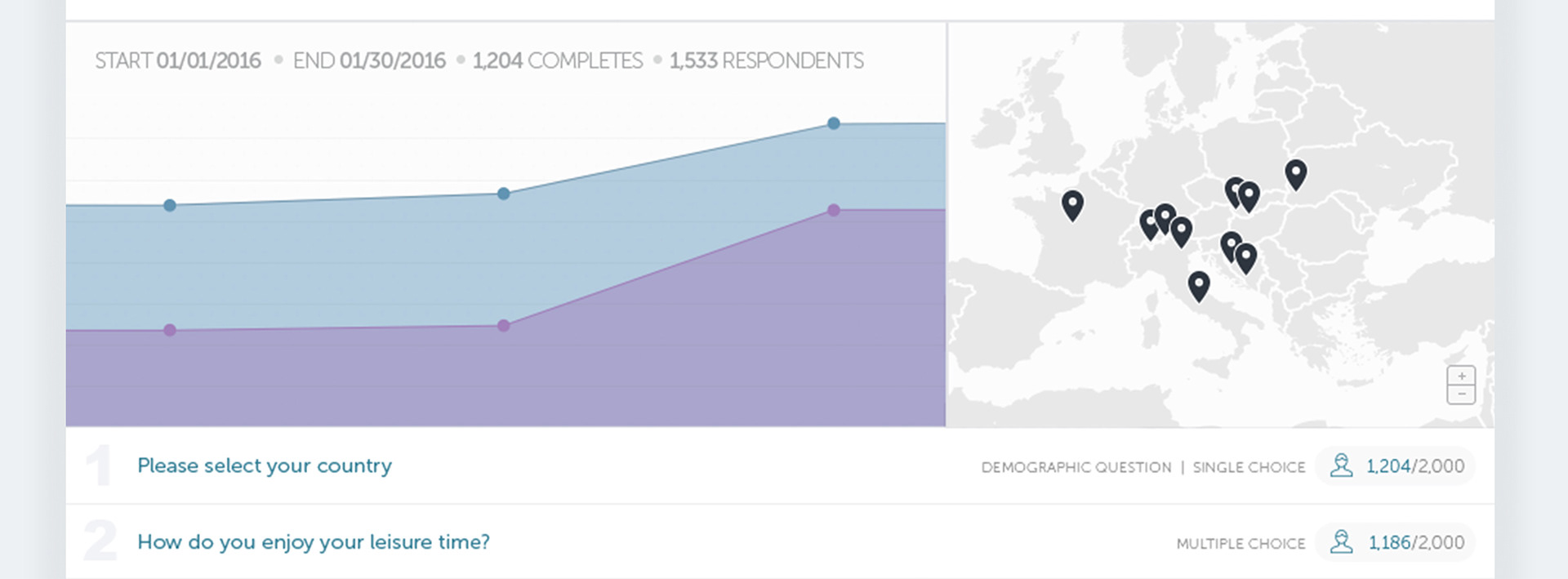
For the main insights of the report, we came up with two most important components:
1. A graph that shows the number of completed surveys and number of respondents
2. A map view which shows from where the respondents are
Per each question we presented in a clear way, the question number, the type of the question and the number of respondents who already answered on the question. You can see these details on the right-hand side below: