AskIt
A B2B2C platform to get answers for daily questions (2015). Create an outstanding interaction experience
ASKIT Website
Company: Toluna
Role: UX&UI expert
Background
ASKIT is a web platform which allows users to share their questions with the world and to get mass wisdom about anything they want to know. Users can ask any type of question-related to any subject. Users could also answer other people questions and be rewarded with points. This platform is a closed group. The members of ASKIT are part of Toluna's big community which includes more than 30 million users.
Challenge
Although the main propose of the product is to share questions and get answers there are two more things that should be taken into consideration:
1. The content of this website is changing often, therefore the UI of it should be simple and quick to answer
2. There are a lot of question types es/no questions, multi selection, thumb-it, battle, rating questions, and more. In addition, users can create a question
Solution
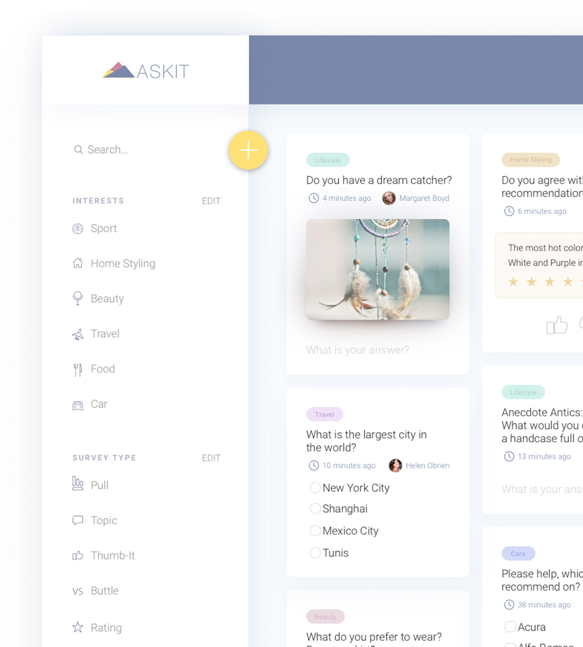
The final design that you can see below is a new redesign for the community platform.
The wireframe below shows the main UI layout:

By clicking on the Yellow floating button, users could add their question and share it with everyone:

Answer on other's questions
The main "Home" screen is the one that shows all the questions available that has been asked lately. The questions are ordered from the most recent to the old once. To answer on a question users only need to click on a card and make his choice, this is one click for an answer.
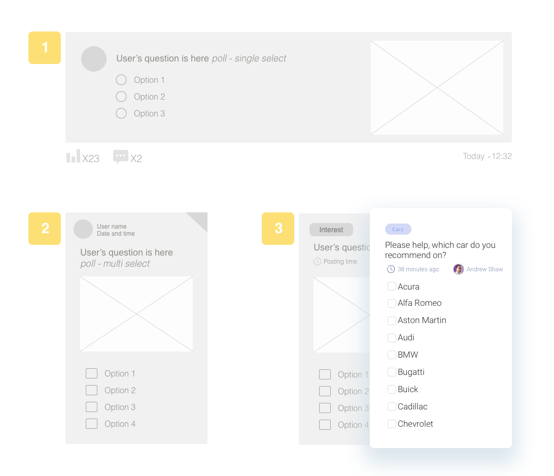
In the image below, you could see the card UI and content hierarchy evolution. The initial thought is that users will be able to see the content on the website as easily as possible, answer on more questions as possible, one after one and be able to see more questions above the desktop fold area.
Wireframe number 3 is the chosen one, the user can see in a clear way the subject tag and can answer quickly on the question.


Filter and see relevant content
It is clear that not all subjects appear in the product, interest all users. Now, with the new design, users can select which content they wants to see and filter it by using the right side menu or identify it on their profile:

Now users also be able to adjust their notification feed, and to be aware if someone answered their questions or tag them in a comment:

The platform designed to be a responsive website to allow the user to answer and create questions also in small devices via the browser, tablet and mobile:

