Starmind
A B2B platform to share knowledge and improve skills (2020). Make user activation as smooth as possible
Starmind responsive B2B products
Company: Starmind
Role: UX designer
Background
Starmind is an internal network for teams, where members can gain skills and share their knowledge.
With the product, users can connect and collaborate knowledge, find experts insistently, ask anonymously, and answer others’ questions. The idea behind the product is that everybody in the company is an expert in some fields.
The AI algorithm knows to identify who is an expert in which field, and it improves itself over time with any user interaction with the product.
When a new question pops up, users get notified of their specific skills and they come to answer their colleagues' questions. Users claim Starmind is on top of their mind when they could not find information anywhere else, or when they know who to ask.
Challenge
From talking to users, conducting usability tests, monitoring NPS (Net Promoter Score), and following quantitative data, we identified 3 main issues to tackle:
1. The navigation in the network is complicated and not intuitive
2. Asking a question is not a clear action
3. A lack of clear unique value and clear benefits for the users (sign-in flow + home page)
To tackle these issues, together with UX Researcher inputs, we built 2 journey maps and emphasized users' feelings and actions.
1. Asking a question flow
2. Onboarding flow

The first journey map was made to identify relevant opportunities for improving asking a question flow. I will show how we tackle these in the first and second use cases.
The second journey map was made to identify pain points users have during the onboarding flow, I will show how we solved some of them in the third use case.
First Use Case / Navigation
Consistency, which is one of the most powerful usability principles, allows uses to adapt to any product they see for the first time. How does it work? By following familiar patterns, which create consistency, users can easily find their way in any product. But what does happen when the product navigation looks different? Well, it creates confusion, and cognitive effort to figure out:
1. What the product is about
2. How can I navigation
Therefore, I launched a 5-second test to get users to feedback about the main page. The results were enlightening and helped us to rethink about the navigation of the product. As mentioned also in the journey map, new users said that there is no main call to action, all seems on the same level and that there are not enough visual cues. Our NPS score was low (-66.7) when it comes to talking about the navigation (the NPS range is -100 to +100). We heard from users words like “Confusing design...” and “..missing structure”.
Main findings:
1. Hierarchy: The page is crowded, it was hard for people to point on the main element on the screen or to think where to click next
2. Focus: Users focus and pay attention to the filter that appears next to the feed (while 78% of users do not use the filters at all). They confused this is the main page of the product and thought this is a filtered feed. Testers also mentioned that the photos in the feed are user profile images, which is wrong, these images are random per question.
Exploring:
To gather insights about common behaviors and patterns, I love to do in this step a benchmark. I take screenshots from another website which has the same content type, by taking a look at all of them together, it is easy to find patterns, such as:
1. Search field bar on the header, which is very different from our tab “Search
2. Two different hierarchies: Main action, secondary actions which are the menu, and third, which are mostly also part of the navigation but these are not main pages of the product

I started with making a list of all our pages and to reorder the hierarchy and the importance of them. I took a look at which parts are most in use, which pages we want to promote to users, and also what are the most popular screen sizes our users use.

Solutions:
To solve the hierarchy issues:
1. I introduced two levels of icons, which were new for the product then. Now we use main full icons on the navigation to indicate main pages. And secondary outlined icons for the rest.
2. I introduced this new design, on the same level on top, the main CTA, to allow users to find easily their way to ask a new question in the network.
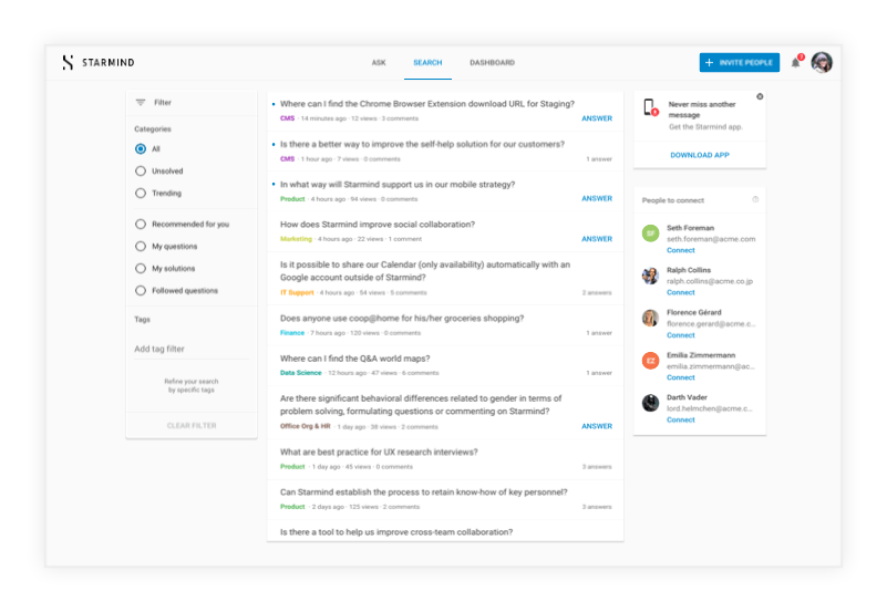
3. The page “Search” named to be “Feed” while the search field is on the header, as a common pattern we all know from other websites.
4. Admin area is now reachable to all users who have administrator permissions
5. Now it is easy to switch between networks with one click away from the profile image

When I tested this new version out with users, their inputs were amazing and it was clear for them how to finish each one of the tasks I gave them to do in the network.
In addition to these changes, we create a place where the user will be able to reach help, learn more about the product, and reach our customer support team. We called this area “User guide” and we added it to the main navigation area.
This section includes links for different areas in the product:
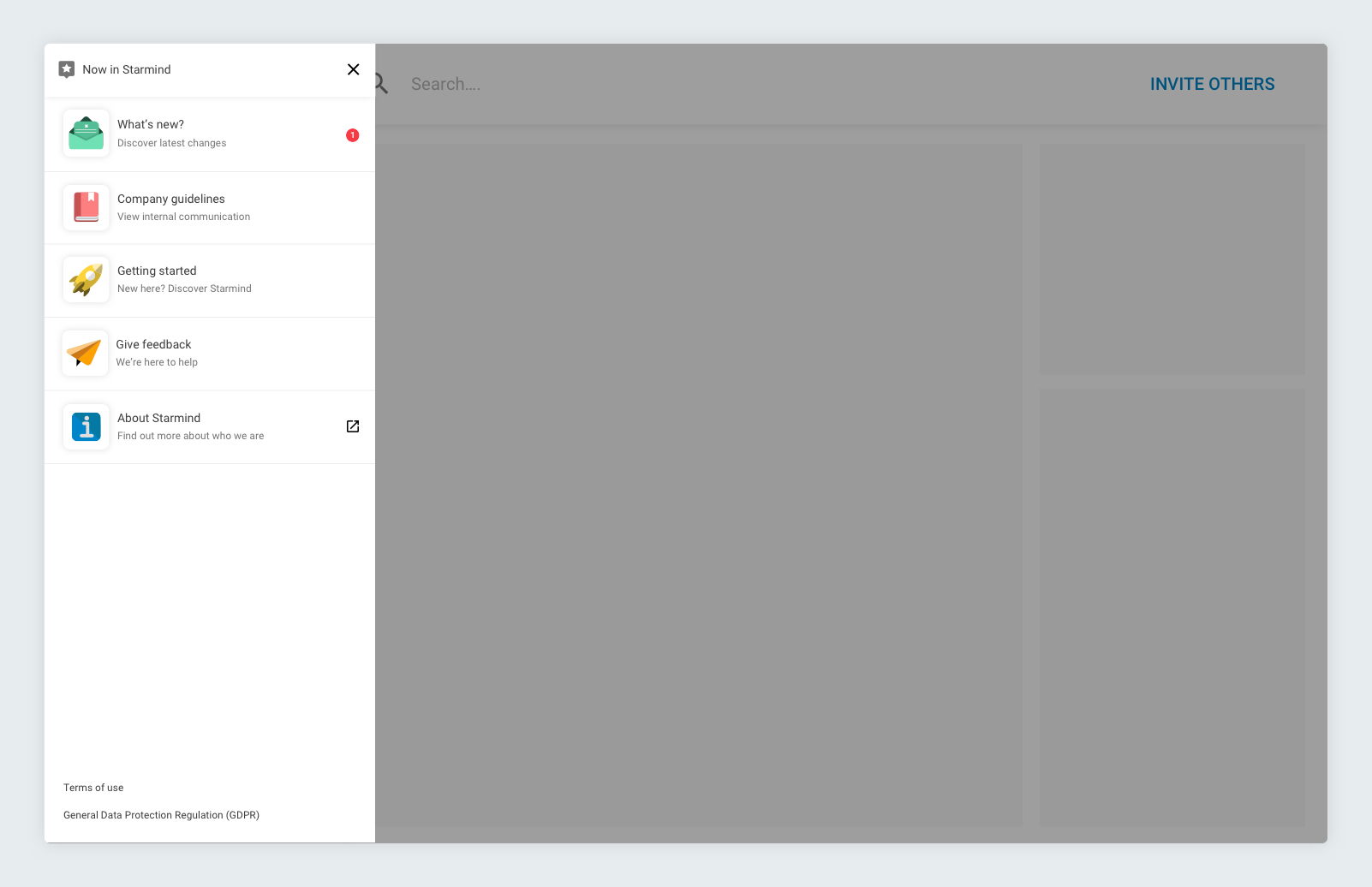
To indicate new features and changes in the product, we created GIFs that appear inside “What’s new” section.

Second Use Case / Asking a question
Improving this flow was part of the understanding that having navigation changes will require changing the way users ask questions, but not only:
1. Having a separate page to ask a question gave users the feeling that asking a question in the network, requires to fill out a long-form, takes time and effort
2. We found that only 35% of users who click on the “Ask” tab, actually submit a question, our mission is to increase this value, to double it
3. We wanted to increase the number of users to ask their first question within 7 days. The reason behind it is that the engagement with the product increases within this time period.

From the users perspective, we saw that the main pain points to ask a question were:
1. It was confusing, it was not clear that “Ask” is the main CTA
2. Users were insecure how asking a question works, what will happen next, who will see it
3. It takes too much effort to ask a question
From gathering all the data, we decided to lunch an a/b test with two new versions of the way to ask a question. From the benchmark, I found out that most of the products use an overlay component to create new content. The assumption is, that asking with an overlay will create the feeling that asking a question is not a hassle.

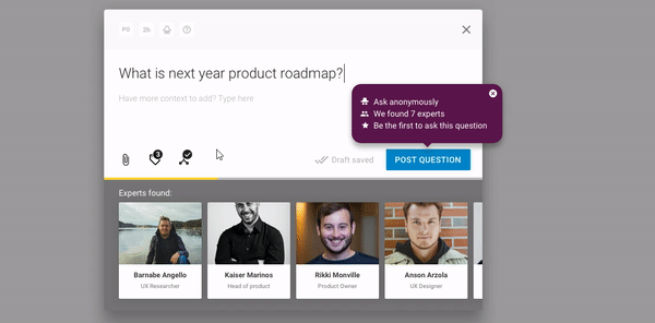
The conclusion from this test is that the overlay version increases the number of questions that have been asked by 67% compared to the full ask page, both for new and existing users.
One of the changes made is to make the “Ask” button much more prominent as a main button on the new navigation. Because of that, we saw less drop off in asking a question funnel, 77% submitted a question after interacting with the overlay (compared to 35% when the button was a tab), the conversion rate of those who click and submit a question is much higher now. For new users, the number of users who asked the first question within the 7 days almost doubled. Yay!
We continued to make small changes on the go based on the learnings of how users use the overlay, below is the current version.

Third Use Case / Value
To improve the activation flow we took a deep look at our user onboarding flow. To see the whole map, we generated a high level of overview of this flow.

The main pain point in the onboarding flow was:
1. Uncertainty about what is the product is about and what user can do there
2. The flow is long and contains a lot of legal documentation which popups
3. The main landing page is overwhelming, contains a lot of unstructured content
We heard from new users that the product “Hardly created any added value” and we saw that:
1. Onboarding journey has 8 steps today which makes too much friction
2. Product Value is not exposed in a clear way to the users in the onboarding flow and not after first sign-in
We started to tackle each one of these issues to make it clear for users what Starmind is about.
Improve onboarding flow
We mapped the onboarding current onboarding flow, we found 8 steps: 3 of them related to setting up the account, 2 legal overlays that no user really reads and 3 screens to adjust your interests. The product value is not mentioned in this onboarding flow, except for two sentences in the 1st email that the user received, which are blurry. It was no surprise when we followed the NPS score which was -66.7 when it comes to having a value using the product.
To solve this flow, we mapped out all the elements that are “not so important” for this flow, to keep it light, short, and to the point. After a long day talking with stakeholders, we found out some alignments ideas:
1. Legal wise, users do not must to see the full text of the legal documentation, they just can tick a checkbox. Anyway, nobody reads these, and if they do, it is one click away.
2. Although most of the users interacted with the overlay which asks to select interests, we move it out, to ask the users in context, and to not force them to handle it while onboarding, even before they saw what this product is about.
3. Where the user needs to select an interface language, we made a preselected dropdown, with the language based on the user’s browser language, so most of the users would need to just continue. Also in this step, we added the legal links, as a last step in the sign-in flow.
4. We added short and fun phrases about what the users can do in this product on the log-in page, even before they started to type one word. They will see a different value every refresh.
5. We changed the layout of the page, we added visual cues to make the flow clear and improve the experience.


Increase the understanding of product value and reach the aha moment
When the login flow is much more clear to users now, we turned to improve the main landing page. If we go back to the journey map, we will see that users were confused with the content of this page, there is no onboarding and the “Feed” page is full of content.
We made a big benchmark of “What is in the main page users see right after login”. There are the results:
1. In most of these pages, users will see a prominent main CTA. This helps users to understand what is the main action they can do in the product.
2. Checklist for new users or any kind of 3 to 5 main next actions the user may take
3. Content suggestions based on what may be relevant for the user
We have started with adding a growl for new users, in their first visit. We decided about 3 steps to explain the main actions user can do in the product. We decided about a growl component since it is not blocking the user from exploring the app while it appears on the bottom right corner. We launched it and took a month to see the use of it. Unfortunately, most of the users close it in the first or second step. Only 31% finished and show all the 3 steps.

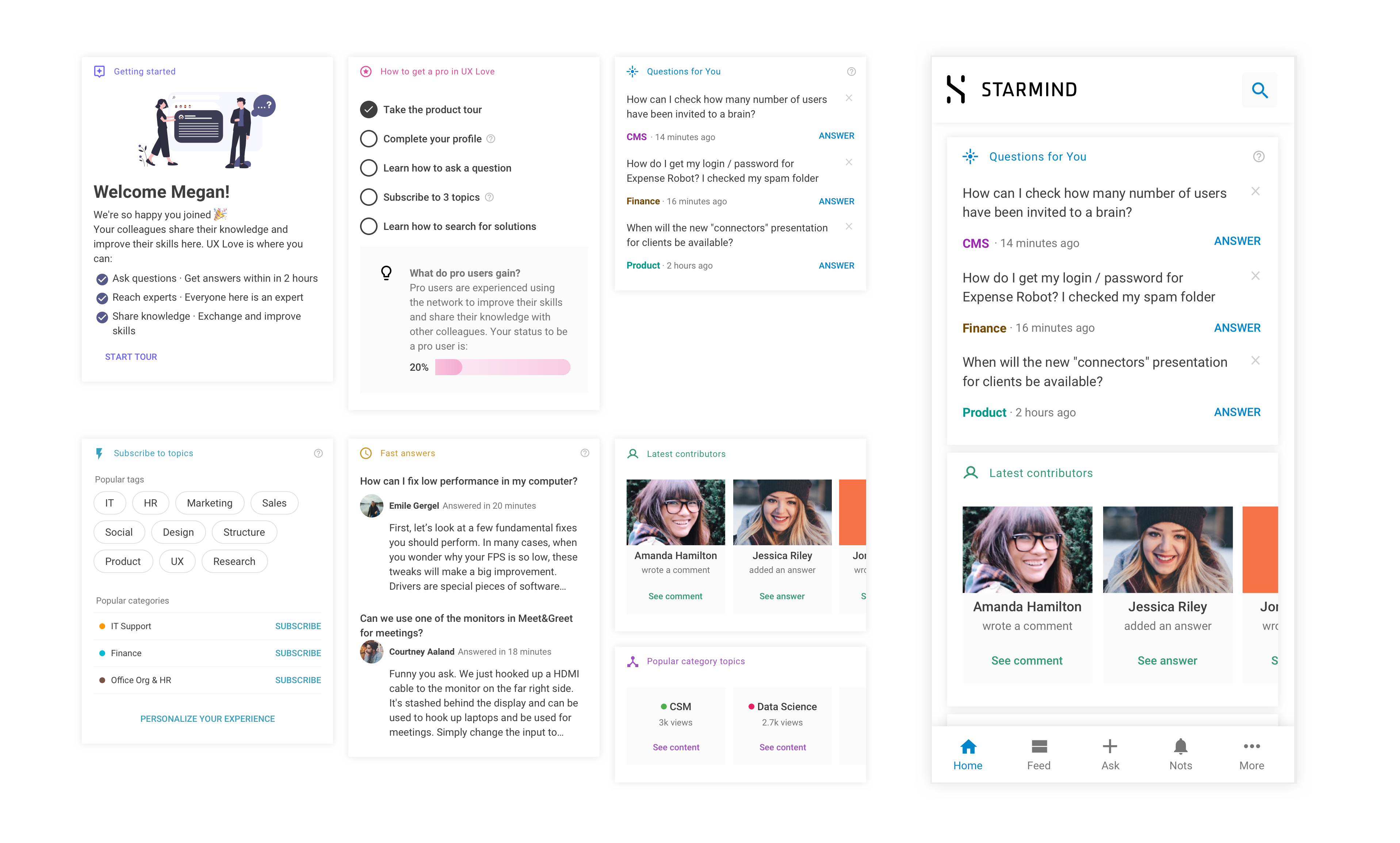
Home page
We continued to think about the best way to show both the value for new users, in terms of content but also onboarding. We took a step back to the onboarding journey map, and we saw that one of the main pain points users talked about, is the “Feed” page and how much it is crowded and confusing. The next step was quite straight forward, we need a proper “Home” page. While the “Feed” page contains all the content in the product, it is hard to find “what is in it for me”.
We started with scratching some ideas about how to promote the main values, to help new users onboard but to make the home page flexible and valuable also for existing users.

Below are some ideas we tested:

From the three versions above, we learned that the idea of what this product is about still not accurate. Based on the usability test we saw that users identify the product as (based on images above from left to right), a place to ask questions, a place to find answers, and for the last, a place to see content relevant to the company. All these are correct, but not aligned with the north start metrics defined, which increases the number of experts and the speed to get answers.
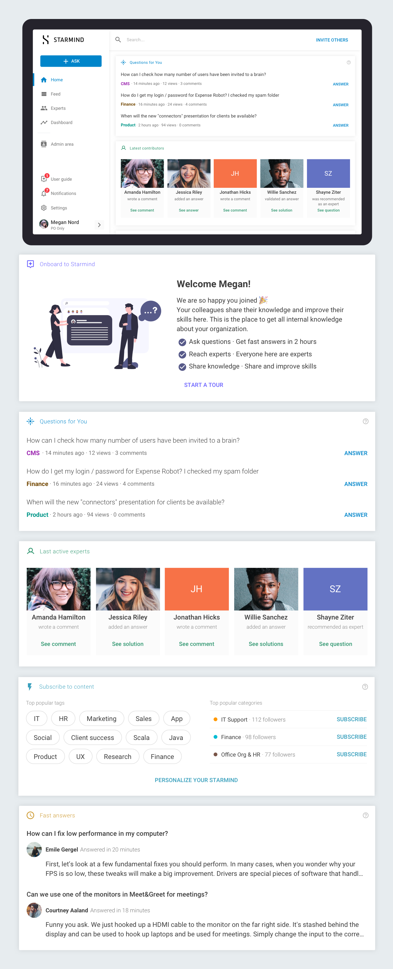
So we came up with a version where users, who are potential experts, will see personalized content for them. It will also reduce the noise of seeing content that is not relevant to users. Below you can see the second ideation round results:

We saw that the one who brings more value and much clear is the 3 columns page. But we still had some issues to handle with this version:
1. The main interaction is to select interests from the feed, if users are not interacting with this module, they will not get the value of the product
2. After selecting interests, the page getting too crowded with three column layout
With these in mind, I came up with this layout as you see below. One module at a time helped users to get the content based on the order of the modules. The content in there is personalized already based on what we know about the user, and it conveys the value we wanted to address.